Q&A 17 How do you visualize two categorical variables with a grouped bar plot?
17.1 Explanation
A grouped bar plot allows you to compare two categorical variables simultaneously by showing side-by-side bars within each group.
This is ideal when:
- You want to analyze proportions or counts across two categorical dimensions
- You need a clean comparison without stacking
- Each group has a manageable number of levels
17.2 Python Code
import pandas as pd
import seaborn as sns
import matplotlib.pyplot as plt

# Load dataset
diamonds = pd.read_csv("data/diamonds_sample.csv")

# Set style
sns.set(style="whitegrid")

# Grouped bar plot: count of cut across clarity levels
plt.figure(figsize=(10, 6))
sns.countplot(data=diamonds, x="clarity", hue="cut", palette="Set2")
plt.title("Grouped Bar Plot: Diamond Cut by Clarity", fontsize=14)
plt.xlabel("Clarity")
plt.ylabel("Count")
plt.tight_layout()
plt.show()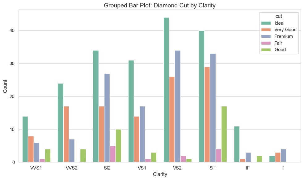
17.3 R Code
library(readr)
library(ggplot2)

# Load dataset
diamonds <- read_csv("data/diamonds_sample.csv")

# Grouped bar plot
ggplot(diamonds, aes(x = clarity, fill = cut)) +
  geom_bar(position = "dodge") +
  scale_fill_brewer(palette = "Set2") +
  theme_minimal() +
  labs(title = "Grouped Bar Plot: Diamond Cut by Clarity",
       x = "Clarity", y = "Count")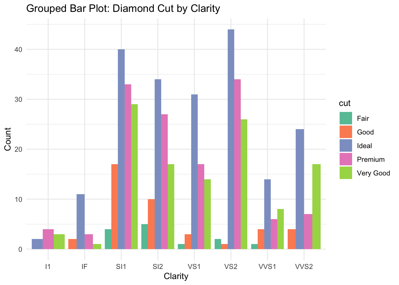
✅ Grouped bar plots allow clean comparison across two categorical dimensions. They’re especially useful for understanding distribution patterns in grouped data.