Q&A 8 How do you compare group distributions using a boxplot?
8.1 Explanation
A boxplot is a standard way to visualize the distribution of a numerical variable across categories. It summarizes key statistics:
- Median (central line)
- Interquartile range (IQR) (box edges)
- Minimum and maximum (whiskers)
- Outliers (points outside whiskers)
Boxplots are ideal for detecting:
- Differences in central tendency
- Variation in spread
- Presence of outliers
- Asymmetry or skewness in the distribution
Adding color and overlaying raw data (e.g., strip plots) improves interpretability.
8.2 Python Code
import pandas as pd
import seaborn as sns
import matplotlib.pyplot as plt

# Load dataset
iris = pd.read_csv("data/iris.csv")

# Set style
sns.set(style="whitegrid")

# Basic boxplot
plt.figure(figsize=(8, 6))
sns.boxplot(data=iris, x="species", y="sepal_length", palette="viridis")
plt.title("Boxplot: Sepal Length by Species", fontsize=14)
plt.xlabel("Species")
plt.ylabel("Sepal Length")
plt.tight_layout()
plt.show()

# Boxplot with overlaid strip plot (raw points)
plt.figure(figsize=(8, 6))
sns.boxplot(data=iris, x="species", y="sepal_length", palette="viridis", width=0.6)
sns.stripplot(data=iris, x="species", y="sepal_length", color="black", alpha=0.5, jitter=True)
plt.title("Boxplot with Raw Points: Sepal Length by Species", fontsize=14)
plt.tight_layout()
plt.show()
/var/folders/m1/0dxpqygn2ds41kxkjgwtftr00000gn/T/ipykernel_75563/1537151029.py:13: FutureWarning:

Passing `palette` without assigning `hue` is deprecated and will be removed in v0.14.0. Assign the `x` variable to `hue` and set `legend=False` for the same effect.

  sns.boxplot(data=iris, x="species", y="sepal_length", palette="viridis")
/var/folders/m1/0dxpqygn2ds41kxkjgwtftr00000gn/T/ipykernel_75563/1537151029.py:22: FutureWarning:

Passing `palette` without assigning `hue` is deprecated and will be removed in v0.14.0. Assign the `x` variable to `hue` and set `legend=False` for the same effect.

  sns.boxplot(data=iris, x="species", y="sepal_length", palette="viridis", width=0.6)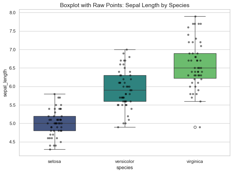
8.3 R Code
library(readr)
library(ggplot2)

# Load dataset
iris <- read_csv("data/iris.csv")

# Basic boxplot
ggplot(iris, aes(x = species, y = sepal_length)) +
  geom_boxplot(fill = "lightblue", color = "black") +
  theme_minimal() +
  labs(title = "Boxplot: Sepal Length by Species", x = "Species", y = "Sepal Length")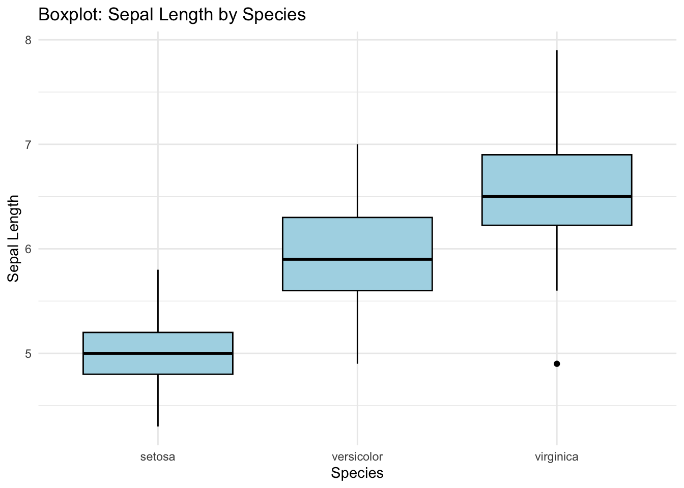
# Boxplot with overlaid jittered points
ggplot(iris, aes(x = species, y = sepal_length)) +
  geom_boxplot(fill = "lightgreen", outlier.shape = NA) +
  geom_jitter(color = "black", width = 0.2, alpha = 0.5) +
  theme_minimal() +
  labs(title = "Boxplot with Raw Points: Sepal Length by Species", x = "Species", y = "Sepal Length")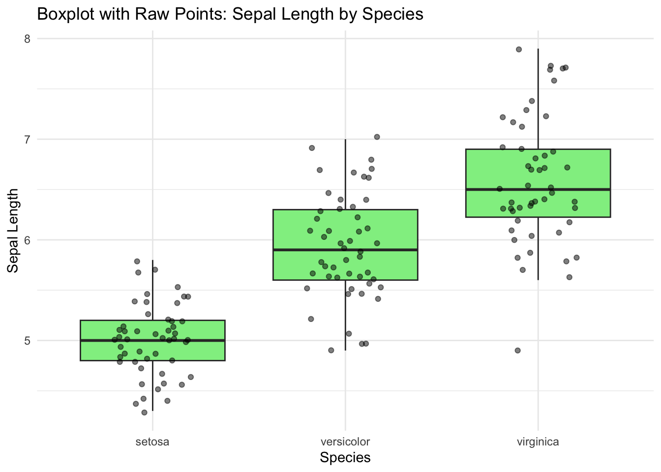
✅ Boxplots offer a compact summary of distribution and spread for each category. When enhanced with color and raw points, they reveal both statistical structure and individual variation clearly.