Q&A 10 How do you visualize overlapping group distributions using a ridge plot?
10.1 Explanation
A ridge plot (also called a joyplot) displays smoothed density curves for a numerical variable across different groups. The curves are stacked and partially overlapping, making it easy to:
- Compare the shape of distributions
- Detect skewness, modality, and spread
- Handle many groups in a compact space
These plots are especially useful in Exploratory Data Analysis (EDA) when you want to:
- Compare distributions across levels of a categorical variable
- Reveal subtle differences in group behavior
- Highlight the overall distribution pattern clearly
10.2 Python Code
import pandas as pd
import seaborn as sns
import matplotlib.pyplot as plt

# Load dataset
iris = pd.read_csv("data/iris.csv")

# Set theme
sns.set(style="white")

# Create ridge-style KDE plot manually
plt.figure(figsize=(8, 6))
species_list = iris["species"].unique()

for i, species in enumerate(species_list):
    subset = iris[iris["species"] == species]
    sns.kdeplot(
        subset["sepal_length"],
        fill=True,
        label=species,
        linewidth=1.5,
        alpha=0.7,
        clip=(4, 8),
    )

plt.title("Ridge-style KDE Plot: Sepal Length by Species", fontsize=14)
plt.xlabel("Sepal Length")
plt.ylabel("Density")
plt.legend(title="Species")
plt.tight_layout()
plt.show()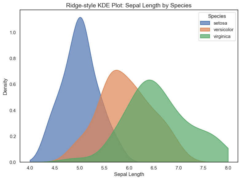
10.3 R Code
library(readr)
library(ggplot2)
library(ggridges)
library(viridis)

# Load dataset
iris <- read_csv("data/iris.csv")

# Ridge plot using ggridges
ggplot(iris, aes(x = sepal_length, y = species, fill = species)) +
  geom_density_ridges(scale = 1.2, alpha = 0.7, color = "white") +
  scale_fill_viridis_d(option = "D") +
  theme_minimal() +
  labs(title = "Ridge Plot: Sepal Length by Species",
       x = "Sepal Length", y = "Species")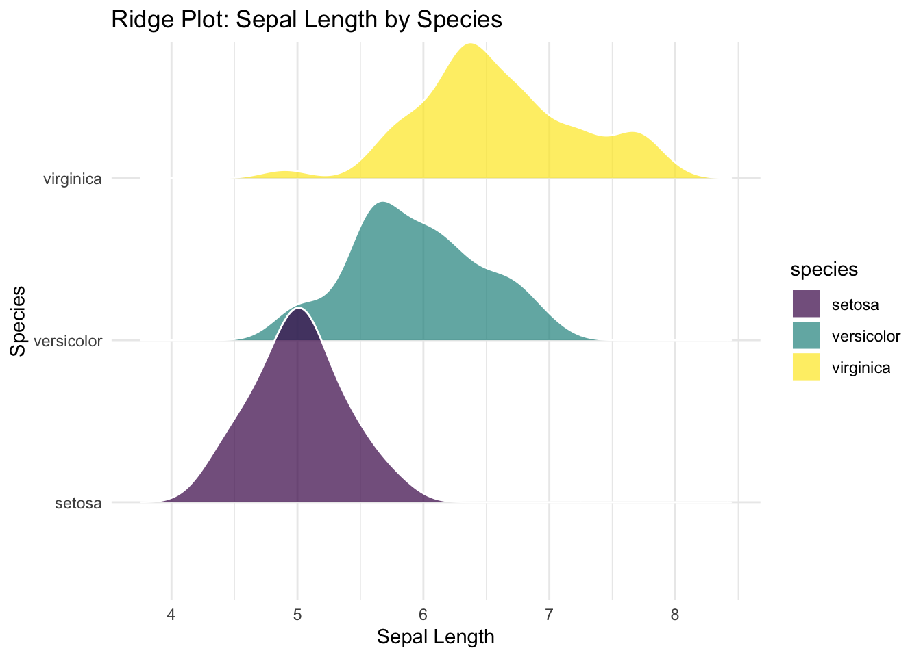
✅ Ridge plots provide a smooth, elegant comparison of multiple distributions. They’re especially useful when working with several categories and aiming to uncover differences in shape or spread.