Q&A 12 How do you show raw observations by group using a strip plot?
12.1 Explanation
A strip plot is a simple yet powerful way to show every individual data point for a numerical variable grouped by a categorical variable. Unlike boxplots or violin plots, which summarize data, strip plots highlight raw measurements.
They are best used when:
- You want complete visibility of individual observations
- Your dataset is small or moderate in size
- You want to explore variation and outliers without summary overlays
Adding jitter (slight random displacement) and using vibrant palettes makes the visualization more readable and visually engaging.
12.2 Python Code
import pandas as pd
import seaborn as sns
import matplotlib.pyplot as plt

# Load dataset
iris = pd.read_csv("data/iris.csv")

# Set style
sns.set(style="whitegrid")

# Warning-free strip plot with hue and palette
plt.figure(figsize=(8, 6))
sns.stripplot(
    data=iris,
    x="species",
    y="sepal_length",
    hue="species",
    jitter=True,
    palette="Set2",
    dodge=False,
    size=6,
    alpha=0.8
)
plt.title("Strip Plot: Sepal Length by Species", fontsize=14)
plt.xlabel("Species")
plt.ylabel("Sepal Length")
plt.legend([],[], frameon=False)  # Hides duplicate legend
plt.tight_layout()
plt.show()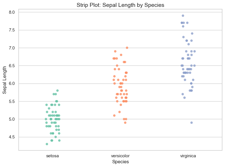
12.3 R Code
library(readr)
library(ggplot2)

# Load dataset
iris <- read_csv("data/iris.csv")

# Strip plot with jitter and color
ggplot(iris, aes(x = species, y = sepal_length, color = species)) +
  geom_jitter(width = 0.2, size = 2.5, alpha = 0.8) +
  scale_color_brewer(palette = "Set2") +
  theme_minimal() +
  labs(title = "Strip Plot: Sepal Length by Species",
       x = "Species", y = "Sepal Length")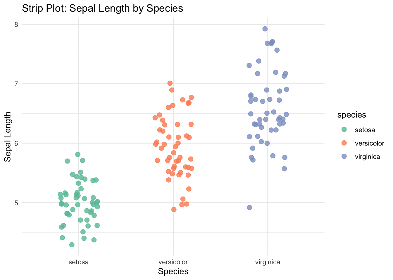
✅ Strip plots offer a direct view of all data points in each category. They are perfect for spotting data spread, clusters, or outliers—especially when combined with color and jitter for clarity.