Q&A 20 How do you show overall trend patterns using a smoothed line?
20.1 Explanation
A smoothed trend line is used to show the underlying relationship between two continuous variables. It’s useful when data is noisy and you want to see:
- General direction of change
- Nonlinear patterns
- Local averages (using LOESS or regression smoothing)
20.2 Python Code
import pandas as pd
import seaborn as sns
import matplotlib.pyplot as plt

# Load dataset
diamonds = pd.read_csv("data/diamonds_sample.csv")

# Smoothed trend line
plt.figure(figsize=(10, 6))
sns.regplot(data=diamonds, x="carat", y="price", lowess=True, scatter_kws={"alpha": 0.4}, line_kws={"color": "#D55E00"})
plt.title("Smoothed Trend: Carat vs Price", fontsize=14)
plt.xlabel("Carat")
plt.ylabel("Price")
plt.tight_layout()
plt.show()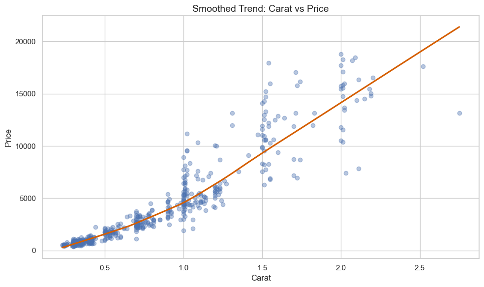
20.3 R Code
library(readr)
library(ggplot2)

# Load dataset
diamonds <- read_csv("data/diamonds_sample.csv")

# LOESS smoothed line
ggplot(diamonds, aes(x = carat, y = price)) +
  geom_point(alpha = 0.4) +
  geom_smooth(method = "loess", se = TRUE, color = "#D55E00") +
  theme_minimal() +
  labs(title = "Smoothed Trend: Carat vs Price",
       x = "Carat", y = "Price")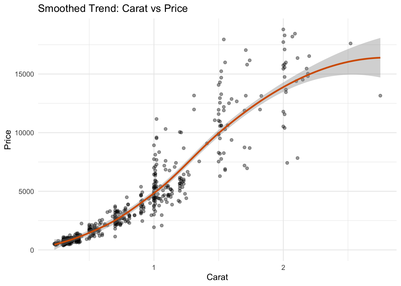
✅ Smoothed trend lines reveal underlying patterns in noisy data. Use them to identify nonlinear growth or saturation points that raw scatter plots may hide.