Q&A 15 How do you show frequency patterns using a histogram?
15.1 Explanation
A histogram is used to show the frequency distribution of a numerical variable by grouping values into bins. It helps you:
- Understand the range and shape of a distribution
- Detect skewness or multi-modality
- Compare group-level differences using color or faceting
For grouped comparisons (e.g., price by cut), it’s common to:
- Use transparent fills (alpha blending)
- Use facets to separate overlapping plots
- Choose appropriate bin width and palettes
15.2 Python Code
import pandas as pd
import seaborn as sns
import matplotlib.pyplot as plt

# Load dataset
diamonds = pd.read_csv("data/diamonds_sample.csv")

# Set style
sns.set(style="whitegrid")

# Histogram with hue
plt.figure(figsize=(10, 6))
sns.histplot(data=diamonds, x="price", hue="cut", element="step", stat="density", common_norm=False,
             palette="Set2", bins=50, alpha=0.6)
plt.title("Histogram of Diamond Price by Cut", fontsize=14)
plt.xlabel("Price")
plt.ylabel("Density")
plt.tight_layout()
plt.show()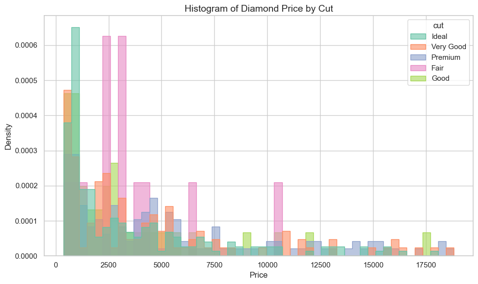
15.3 R Code
library(readr)
library(ggplot2)

# Load dataset
diamonds <- read_csv("data/diamonds_sample.csv")

# Histogram with color fill and transparency
ggplot(diamonds, aes(x = price, fill = cut)) +
  geom_histogram(position = "identity", bins = 50, alpha = 0.6, color = "black") +
  scale_fill_brewer(palette = "Set2") +
  theme_minimal() +
  labs(title = "Histogram of Diamond Price by Cut",
       x = "Price", y = "Count")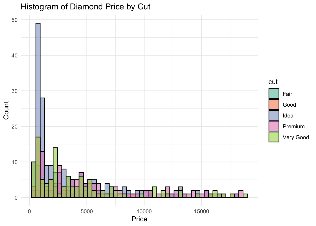
✅ Histograms are ideal for visualizing frequency and shape. By using color or faceting, you can explore how distributions vary across groups like diamond cut.