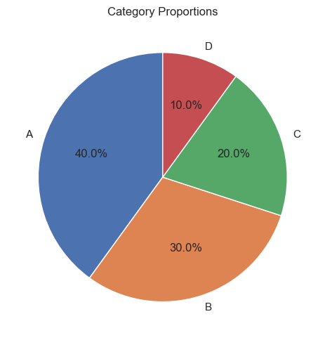
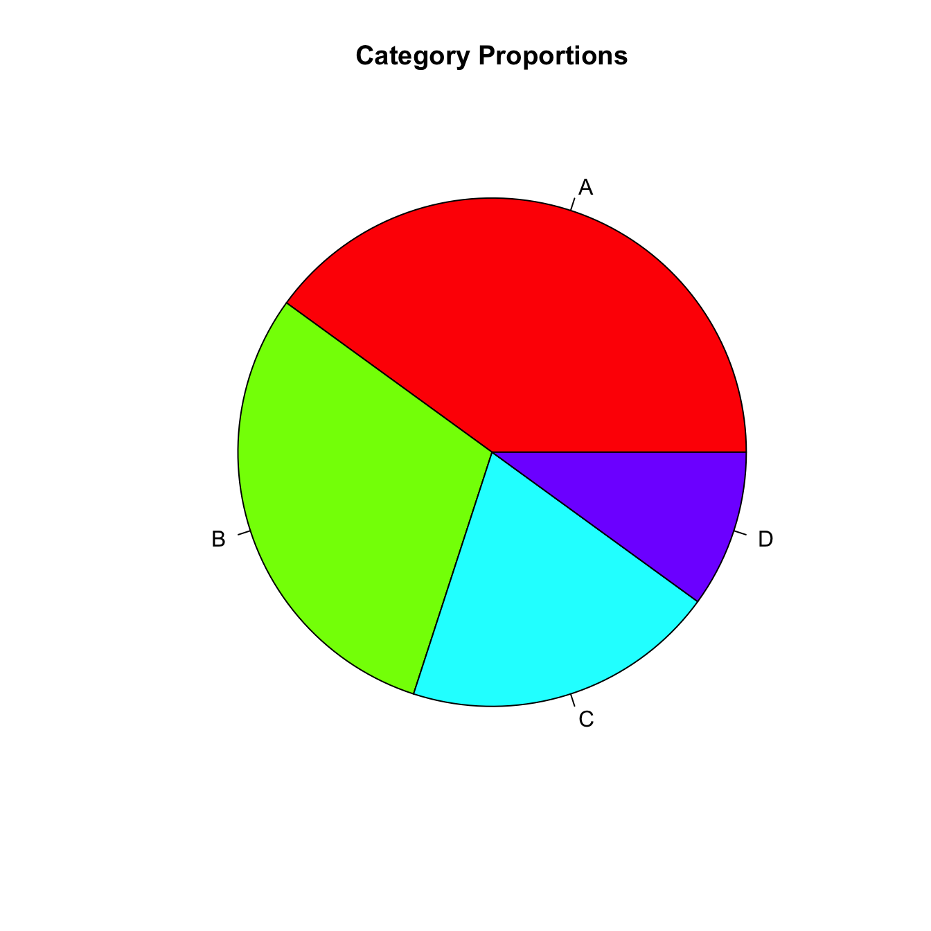
Q&A 30 How do you visualize simple proportions using a pie chart?
30.1 Explanation
A pie chart represents parts of a whole as slices of a circle. Each slice’s size is proportional to its value, making it easy to visualize category proportions at a glance.
- Best used when comparing a small number of categories (≤5)
- Labels or percentages should be clearly shown
- Not ideal for precise comparisons — bar charts are usually better
Use pie charts in: - Survey responses (e.g., favorite colors, device usage) - Market share or budget composition - Simple storytelling visuals