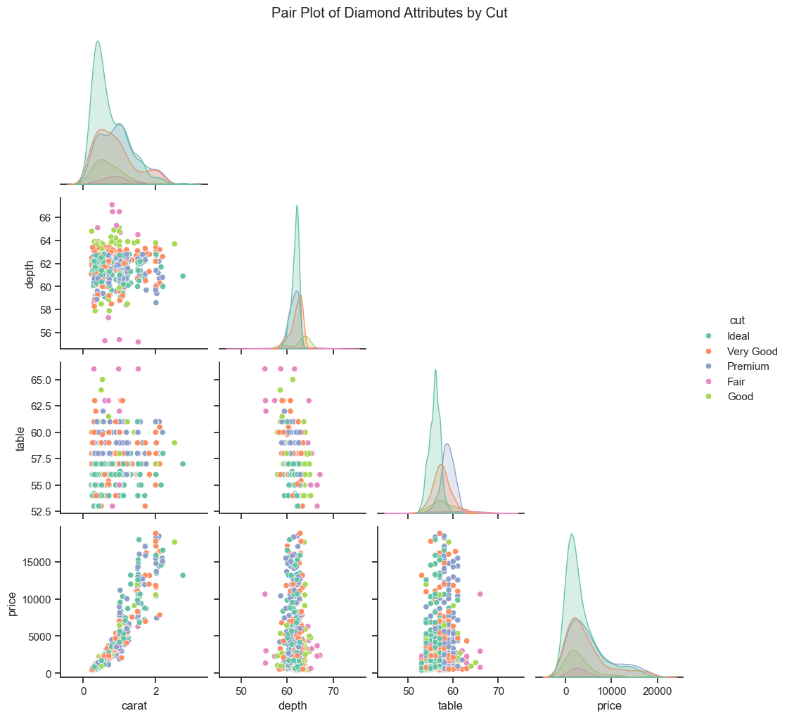
Q&A 22 How do you uncover relationships between multiple variables using a pair plot?
22.1 Explanation
A pair plot (or scatterplot matrix) allows you to explore relationships between several numeric variables at once. It shows:
- Scatter plots for every variable pair
- Histograms or density plots on the diagonal
- Optional color (
hue) to separate groups
It’s useful for spotting correlations, clusters, and outliers in multivariate data.
22.2 Python Code
import pandas as pd
import seaborn as sns
import matplotlib.pyplot as plt

# Load dataset
diamonds = pd.read_csv("data/diamonds_sample.csv")

# Select relevant numeric variables + categorical hue
subset = diamonds[["carat", "depth", "table", "price", "cut"]]

# Pair plot
sns.set(style="ticks")
sns.pairplot(subset, hue="cut", palette="Set2", corner=True)
plt.suptitle("Pair Plot of Diamond Attributes by Cut", y=1.02)
plt.show()
22.3 R Code
library(readr)
library(GGally)
library(dplyr)

# Load dataset and sample for speed
diamonds <- read_csv("data/diamonds_sample.csv")

# Pair plot
ggpairs(diamonds, aes(color = cut), columns = 1:4,
        upper = list(continuous = wrap("points", alpha = 0.5)),
        diag = list(continuous = wrap("densityDiag")),
        lower = list(continuous = wrap("smooth", alpha = 0.3))) +
  theme_minimal()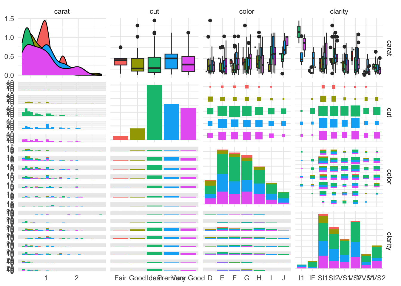
✅ Pair plots are ideal for detecting multivariate patterns. Using color (
hue) reveals how groups differ in structure and correlation.