Q&A 9 How do you compare distribution shape and summary stats using a violin plot?
9.1 Explanation
A violin plot combines the benefits of a boxplot and a density plot. It shows:
- The kernel density estimate of the data distribution (mirrored on both sides)
- Median and IQR through an embedded boxplot
- The width of the violin reflects the frequency of values
This makes violin plots ideal when you want to explore both:
- Shape and modality of the distribution
- Statistical summaries like median and quartiles
Using color palettes and overlaying a boxplot improves clarity and visual appeal.
9.2 Python Code
import pandas as pd
import seaborn as sns
import matplotlib.pyplot as plt

# Load dataset
iris = pd.read_csv("data/iris.csv")

# Set theme
sns.set(style="whitegrid")

# Violin plot with boxplot in the center
plt.figure(figsize=(8, 6))
sns.violinplot(data=iris, x="species", y="sepal_length", inner="box", palette="Set2")
plt.title("Violin Plot with Boxplot: Sepal Length by Species", fontsize=14)
plt.xlabel("Species")
plt.ylabel("Sepal Length")
plt.tight_layout()
plt.show()
/var/folders/m1/0dxpqygn2ds41kxkjgwtftr00000gn/T/ipykernel_75563/471915172.py:13: FutureWarning:
Passing `palette` without assigning `hue` is deprecated and will be removed in v0.14.0. Assign the `x` variable to `hue` and set `legend=False` for the same effect.
sns.violinplot(data=iris, x="species", y="sepal_length", inner="box", palette="Set2")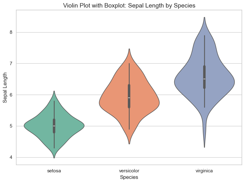
9.3 R Code
library(readr)
library(ggplot2)

# Load dataset
iris <- read_csv("data/iris.csv")

# Violin plot with embedded boxplot
ggplot(iris, aes(x = species, y = sepal_length, fill = species)) +
  geom_violin(trim = FALSE, color = "gray40") +
  geom_boxplot(width = 0.1, color = "black", outlier.shape = NA) +
  scale_fill_brewer(palette = "Set2") +
  theme_minimal() +
  labs(title = "Violin Plot with Boxplot: Sepal Length by Species",
       x = "Species", y = "Sepal Length")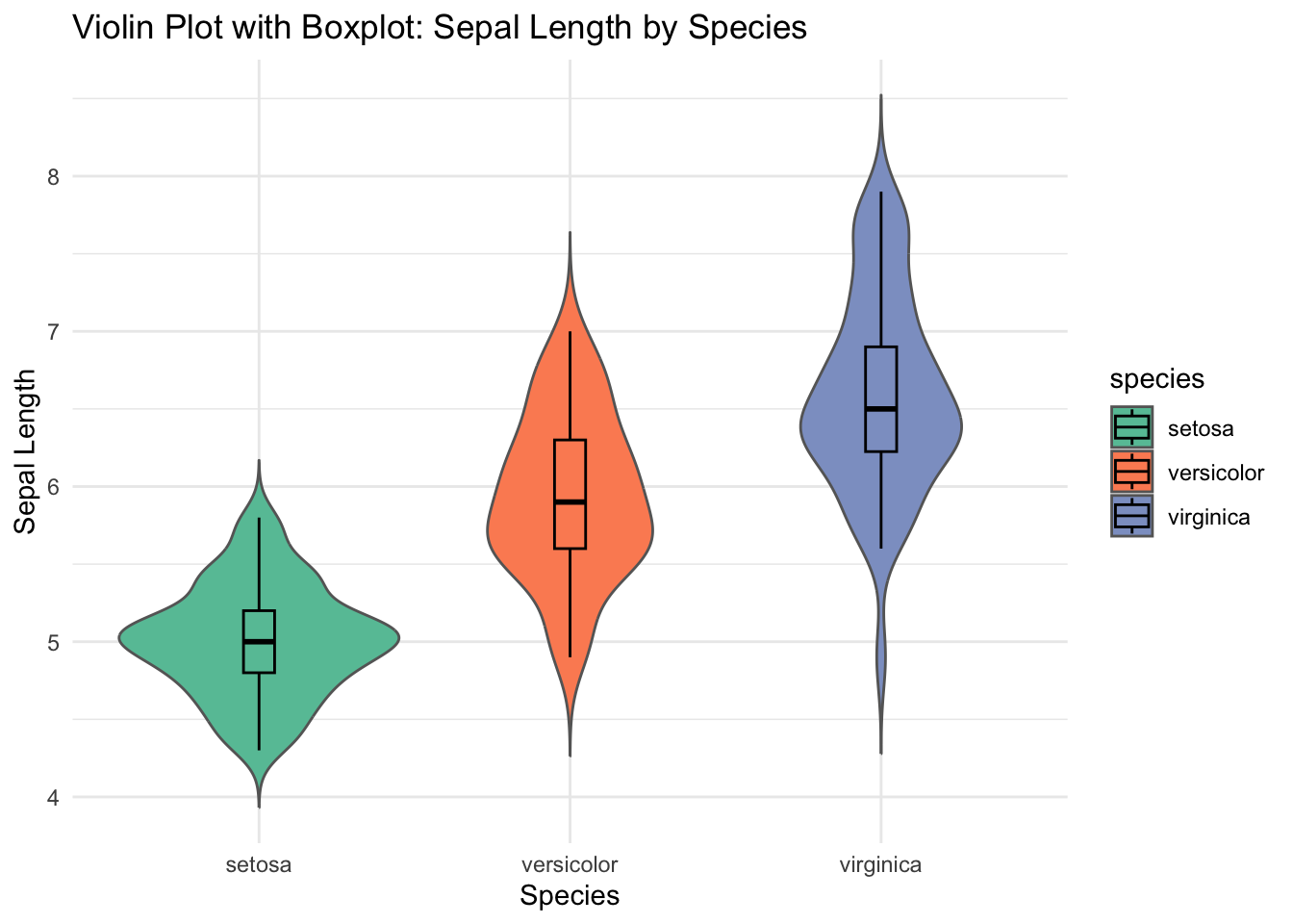
✅ Violin plots are powerful for visualizing both distribution shape and group-level statistics. The embedded boxplot helps interpret quartiles, while the violin shape reveals modality and spread.