Q&A 13 How do you show group means and variability using a bar plot?
13.1 Explanation
A bar plot with error bars summarizes numerical data by showing:
- Mean value for each category as a bar
- Error bars representing variability (e.g., standard deviation or standard error)
This is ideal for comparing central tendencies between groups, especially when:
- You’ve already summarized your data
- You want to highlight differences in means
- Distribution details (e.g., skewness, modality) are less important
Adding colors using hue and modern palettes enhances readability and prevents warnings.
13.2 Python Code
import pandas as pd
import seaborn as sns
import matplotlib.pyplot as plt

# Load dataset
iris = pd.read_csv("data/iris.csv")

# Set style
sns.set(style="whitegrid")

# Bar plot with error bars (standard deviation), hue to avoid warnings
plt.figure(figsize=(8, 6))
sns.barplot(
    data=iris,
    x="species",
    y="sepal_length",
    hue="species",
    palette="Set2",
    ci="sd",
    errorbar="sd",
    capsize=0.1
)
plt.title("Bar Plot with Error Bars: Sepal Length by Species", fontsize=14)
plt.xlabel("Species")
plt.ylabel("Mean Sepal Length ± SD")
plt.legend([],[], frameon=False)  # Hides duplicate legend
plt.tight_layout()
plt.show()
/var/folders/m1/0dxpqygn2ds41kxkjgwtftr00000gn/T/ipykernel_75563/2750927964.py:13: FutureWarning:
The `ci` parameter is deprecated. Use `errorbar='sd'` for the same effect.
sns.barplot(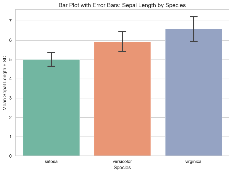
13.3 R Code
library(readr)
library(ggplot2)
library(dplyr)

# Load dataset
iris <- read_csv("data/iris.csv")

# Summarize mean and standard deviation
summary_df <- iris %>%
  group_by(species) %>%
  summarise(
    mean_val = mean(sepal_length),
    sd_val = sd(sepal_length),
    .groups = "drop"
  )

# Bar plot with error bars
ggplot(summary_df, aes(x = species, y = mean_val, fill = species)) +
  geom_bar(stat = "identity", width = 0.6) +
  geom_errorbar(aes(ymin = mean_val - sd_val, ymax = mean_val + sd_val), width = 0.2) +
  scale_fill_brewer(palette = "Set2") +
  theme_minimal() +
  labs(title = "Bar Plot with Error Bars: Sepal Length by Species",
       x = "Species", y = "Mean Sepal Length ± SD")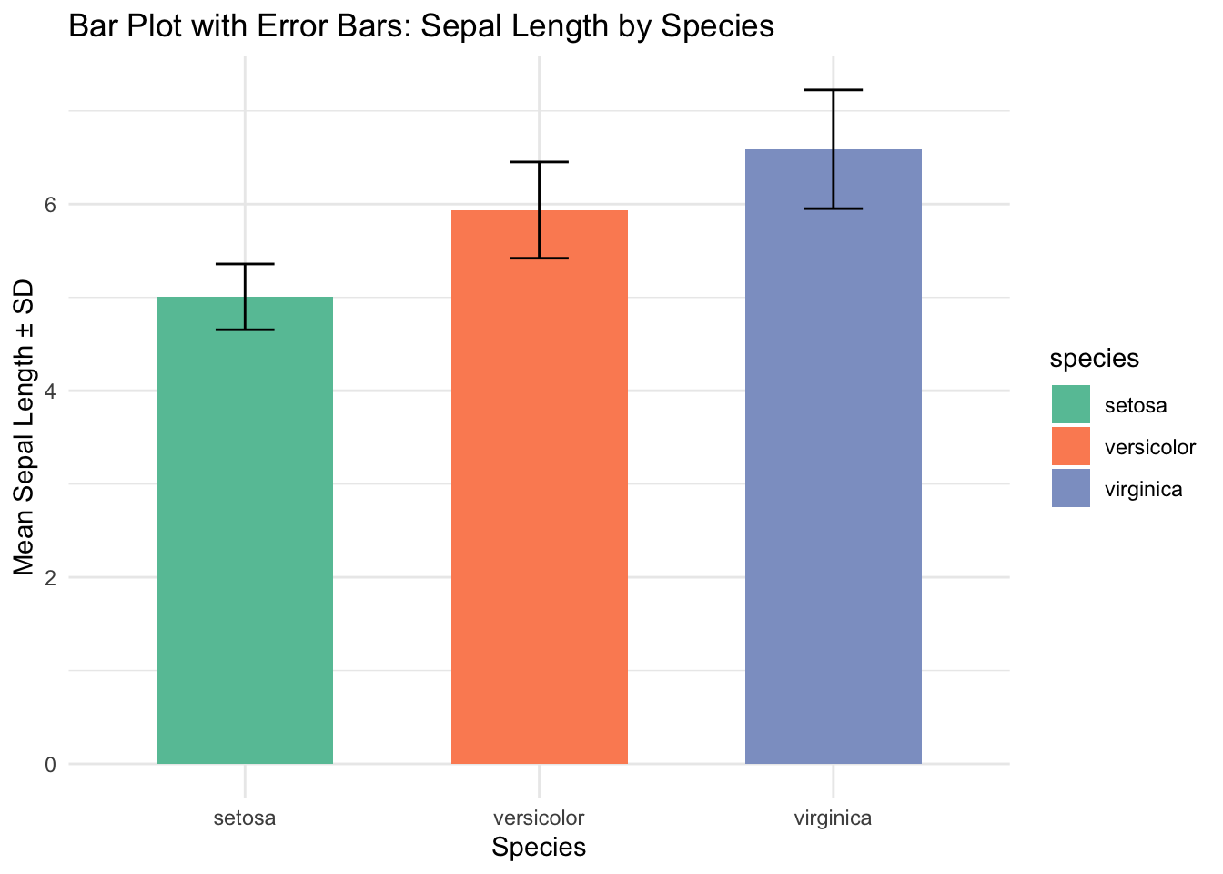
✅ Bar plots with error bars are great for summarizing group-level differences in means. Using
hueorfillensures correct color mapping and avoids warnings in modern plotting libraries.