Q&A 14 How do you show group summaries using a dot plot?
14.1 Explanation
A dot plot is a simple yet effective way to compare group-level summary statistics, such as the mean price of diamonds per quality grade. It’s particularly helpful when:
- You want to emphasize central values without clutter
- The number of groups is moderate
- You want a clean alternative to a bar chart
Dot plots are enhanced with color, size, and error bars for visual clarity. They’re perfect for summary comparisons like mean or median ± standard deviation.
14.2 Python Code
import pandas as pd
import seaborn as sns
import matplotlib.pyplot as plt

# Load dataset
diamonds = pd.read_csv("data/diamonds_sample.csv")

# Compute group summary
summary_df = diamonds.groupby("cut", as_index=False).agg(
    mean_price=("price", "mean"),
    sd_price=("price", "std")
)

# Create dot plot
sns.set(style="whitegrid")
plt.figure(figsize=(8, 6))
sns.pointplot(
    data=summary_df,
    x="cut",
    y="mean_price",
    # palette="Set2",
    errorbar=None,
    join=False,
    markers="o"

)

# Add error bars manually
plt.errorbar(
    x=range(len(summary_df)),
    y=summary_df["mean_price"],
    yerr=summary_df["sd_price"],
    fmt='none',
    capsize=5,
    color='black'
)

plt.title("Dot Plot with Error Bars: Diamond Price by Cut", fontsize=14)
plt.xlabel("Cut")
plt.ylabel("Mean Price ± SD")
plt.tight_layout()
plt.show()
/var/folders/m1/0dxpqygn2ds41kxkjgwtftr00000gn/T/ipykernel_75563/1871995440.py:17: UserWarning:

The `join` parameter is deprecated and will be removed in v0.15.0. You can remove the line between points with `linestyle='none'`.

  sns.pointplot(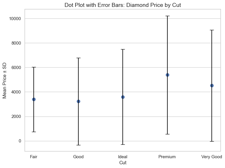
14.3 R Code
library(readr)
library(ggplot2)
library(dplyr)

# Load dataset
diamonds <- read_csv("data/diamonds_sample.csv")

# Compute mean and SD
summary_df <- diamonds %>%
  group_by(cut) %>%
  summarise(
    mean_price = mean(price),
    sd_price = sd(price),
    .groups = "drop"
  )

# Dot plot with error bars
ggplot(summary_df, aes(x = cut, y = mean_price, color = cut)) +
  geom_point(size = 4) +
  geom_errorbar(aes(ymin = mean_price - sd_price, ymax = mean_price + sd_price), width = 0.2) +
  scale_color_brewer(palette = "Set2") +
  theme_minimal() +
  labs(title = "Dot Plot with Error Bars: Diamond Price by Cut",
       x = "Cut", y = "Mean Price ± SD")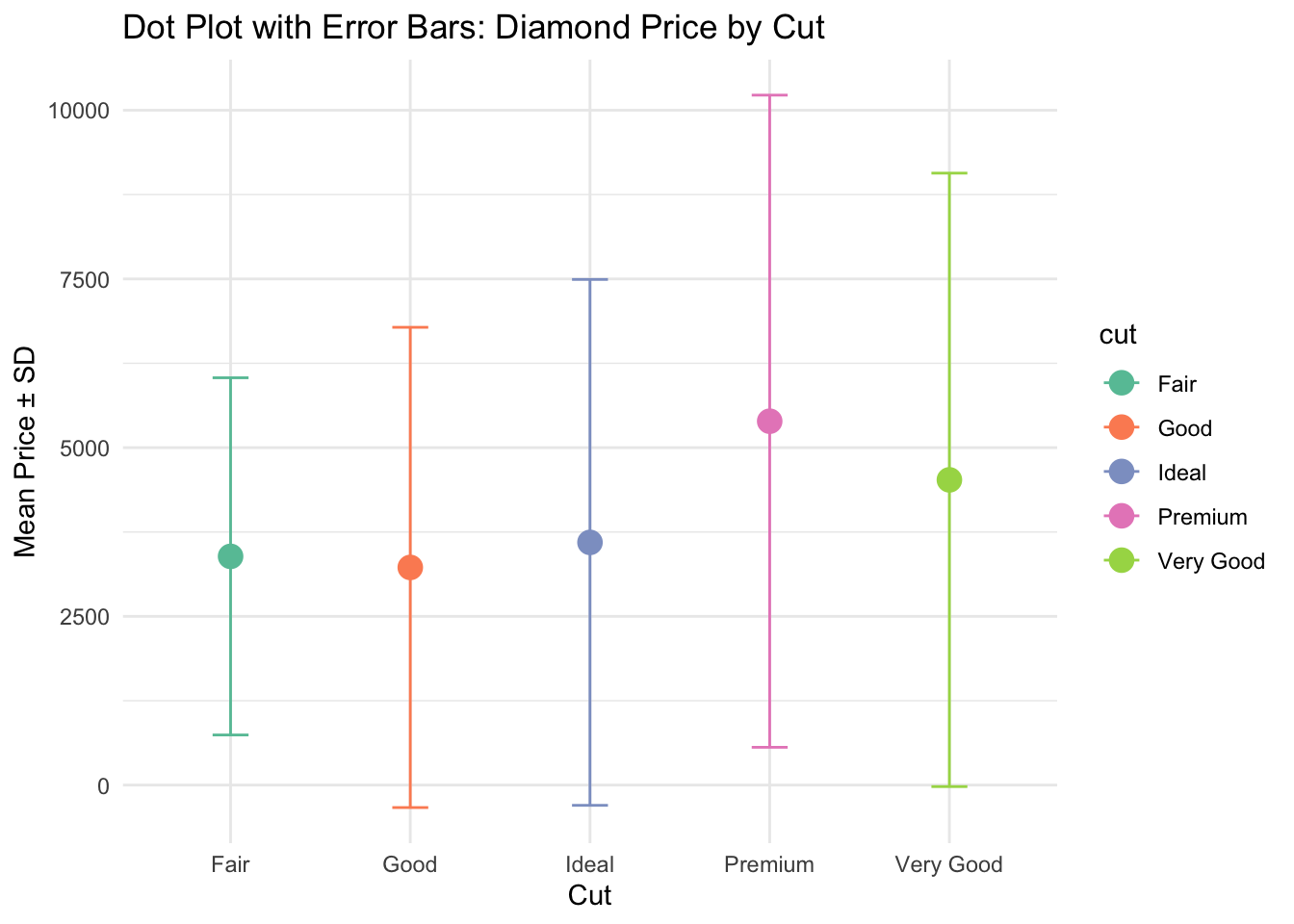
✅ Dot plots are a compact, precise way to compare summary statistics across groups. When used with color and error bars, they highlight differences in group means with clarity and elegance.