Q&A 25 How do you quantify linear relationships between numerical variables using a correlation heatmap?
25.1 Explanation
A correlation heatmap visually represents the strength and direction of linear relationships between numeric variables using Pearson’s correlation coefficient (r):
- Values range from -1 (perfect negative) to +1 (perfect positive)
- Darker or more saturated colors indicate stronger correlations
- Symmetric across the diagonal (correlation with self = 1)
It’s a compact way to assess multicollinearity, feature redundancy, or predictive potential.
25.2 Python Code
import pandas as pd
import seaborn as sns
import matplotlib.pyplot as plt

# Load dataset
diamonds = pd.read_csv("data/diamonds_sample.csv")

# Select numerical columns only
num_df = diamonds[["carat", "depth", "table", "price", "x", "y", "z"]]

# Compute correlation matrix
corr = num_df.corr(numeric_only=True)

# Heatmap
plt.figure(figsize=(8, 6))
sns.heatmap(corr, annot=True, fmt=".2f", cmap="coolwarm", center=0)
plt.title("Correlation Heatmap of Diamond Variables", fontsize=14)
plt.tight_layout()
plt.show()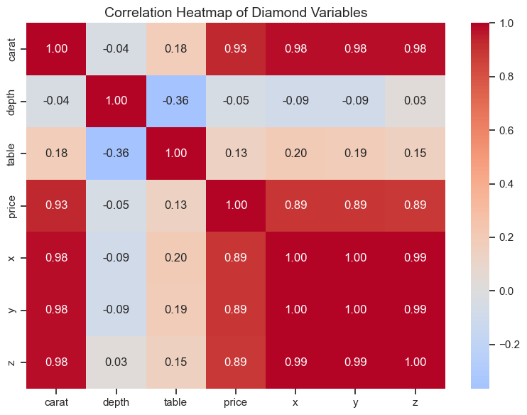
25.3 R Code
library(readr)
library(ggplot2)
library(corrplot)

# Load dataset
diamonds <- read_csv("data/diamonds_sample.csv")

# Compute correlation matrix
num_vars <- diamonds %>% select(carat, depth, table, price, x, y, z)
corr_matrix <- cor(num_vars, use = "complete.obs")

# Plot correlation heatmap
corrplot(corr_matrix, method = "color", type = "upper", addCoef.col = "black",
         tl.cex = 0.8, number.cex = 0.7, col = colorRampPalette(c("blue", "white", "red"))(200))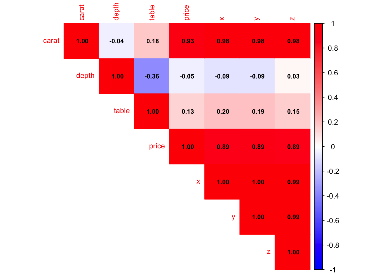
✅ Correlation heatmaps are a fast and effective way to explore relationships between numerical variables and detect potential feature interactions.