Q&A 23 How do you compare distributions across groups using facet plots?
23.1 Explanation
Facet plots allow you to split your data into multiple panels based on a categorical variable, making it easier to compare group-specific distributions or relationships without overlap.
Unlike standard plots that layer everything into one axis, facet plots:
- Create one plot per group, arranged side by side or in a grid
- Highlight differences in shape, spread, or skew between categories
- Work well with histograms, KDE plots, scatter plots, and more
They’re useful for: - Comparing distributions (e.g., KDE or histograms across species or cut) - Analyzing trends across subgroups - Preventing overplotting in dense datasets
23.2 Python Code
import pandas as pd
import seaborn as sns
import matplotlib.pyplot as plt
# Load data
diamonds = pd.read_csv("data/diamonds_sample.csv")
# Faceted histogram by 'cut'
sns.displot(data=diamonds, x="price", col="cut", bins=30, color="steelblue", aspect=0.8)
plt.tight_layout()
plt.show()
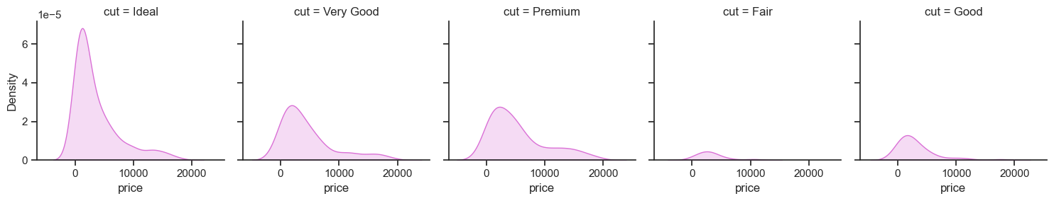
# Faceted KDE plot with fill
sns.displot(data=diamonds, x="price", col="cut", kind="kde", fill=True, height=3, aspect=1, color="orchid")
plt.tight_layout()
plt.show()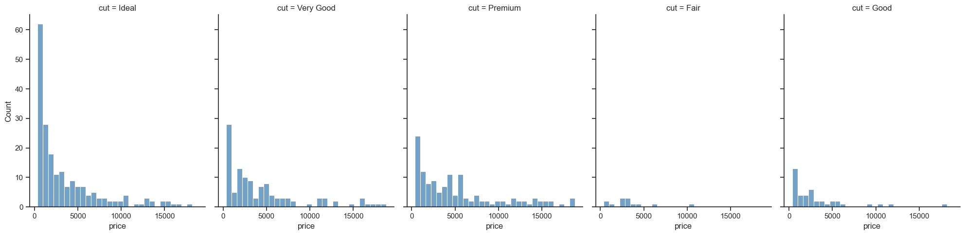
23.3 R Code
library(ggplot2)
library(readr)

# Load data
diamonds <- read_csv("data/diamonds_sample.csv")

# Histogram faceted by cut
ggplot(diamonds, aes(x = price)) +
  geom_histogram(fill = "steelblue", bins = 30, color = "white") +
  facet_wrap(~cut, scales = "free_y") +
  theme_minimal() +
  labs(title = "Price Distribution by Cut")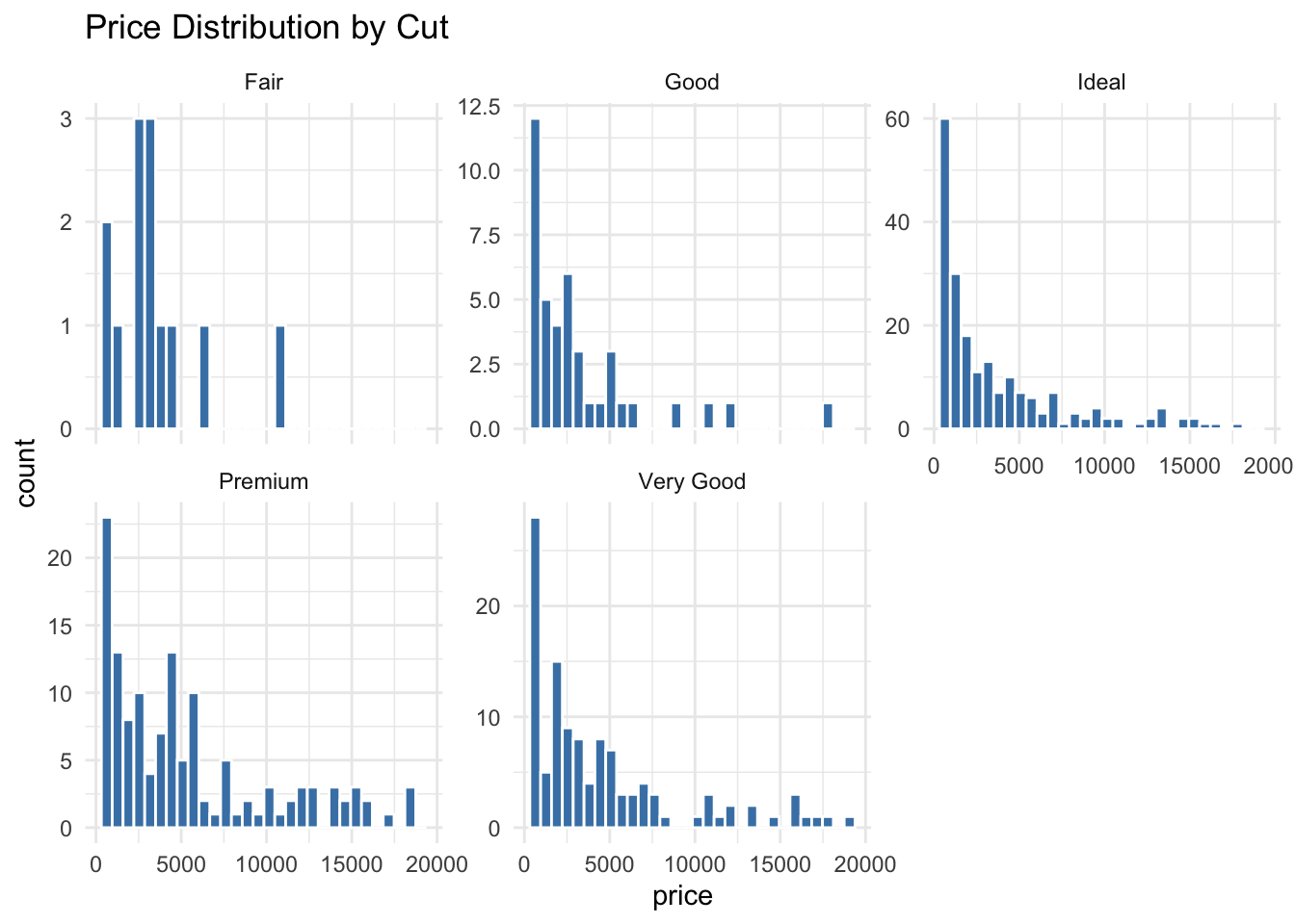
# KDE faceted by cut
ggplot(diamonds, aes(x = price)) +
  geom_density(fill = "orchid", alpha = 0.6) +
  facet_wrap(~cut, scales = "free_y") +
  theme_minimal() +
  labs(title = "Smoothed Price Distribution by Cut")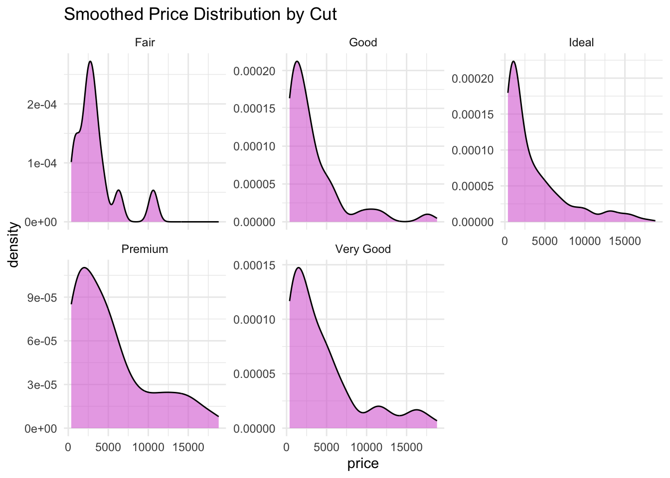
✅ Facet plots are ideal for comparing group-specific patterns across a categorical variable. They prevent clutter and make distribution differences easier to detect than overlapping in a single plot.