Q&A 19 How do you visualize trends for multiple groups using a line plot?
19.1 Explanation
A line plot is ideal for visualizing trends over an ordered variable. In this example, we compute the average sepal length for each species across sepal width bins.
This helps reveal group-specific patterns — for example, whether one species has consistently longer sepals as sepal width increases.
19.2 Python Code
import pandas as pd
import matplotlib.pyplot as plt
import seaborn as sns

# Load dataset
df = pd.read_csv("data/iris.csv")

# Bin sepal_width to simulate order
df["width_bin"] = pd.cut(df["sepal_width"], bins=5)

# Group by bin and species, compute mean sepal length
grouped = df.groupby(["width_bin", "species"])["sepal_length"].mean().reset_index()

# Convert bin to string for plotting
grouped["width_bin"] = grouped["width_bin"].astype(str)

# Line plot
plt.figure(figsize=(8, 5))
sns.lineplot(data=grouped, x="width_bin", y="sepal_length", hue="species", marker="o")
plt.title("Average Sepal Length by Sepal Width Bin and Species")
plt.xlabel("Sepal Width Bin")
plt.ylabel("Mean Sepal Length")
plt.xticks(rotation=45)
plt.tight_layout()
plt.show()
/var/folders/m1/0dxpqygn2ds41kxkjgwtftr00000gn/T/ipykernel_75563/1682245456.py:12: FutureWarning: The default of observed=False is deprecated and will be changed to True in a future version of pandas. Pass observed=False to retain current behavior or observed=True to adopt the future default and silence this warning.
grouped = df.groupby(["width_bin", "species"])["sepal_length"].mean().reset_index()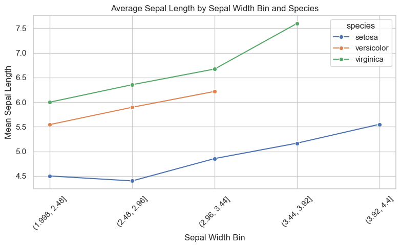
19.3 R Code
library(dplyr)
library(ggplot2)
library(readr)

# Load dataset
df <- read_csv("data/iris.csv")

# Bin sepal width into 5 intervals
df <- df %>%
  mutate(width_bin = cut(sepal_width, breaks = 5))

# Compute mean sepal length by bin and species
grouped <- df %>%
  group_by(width_bin, species) %>%
  summarise(mean_length = mean(sepal_length), .groups = "drop")

# Line plot
ggplot(grouped, aes(x = width_bin, y = mean_length, group = species, color = species)) +
  geom_line() +
  geom_point() +
  labs(
    title = "Average Sepal Length by Sepal Width Bin and Species",
    x = "Sepal Width Bin",
    y = "Mean Sepal Length"
  ) +
  theme_minimal() +
  theme(axis.text.x = element_text(angle = 45, hjust = 1))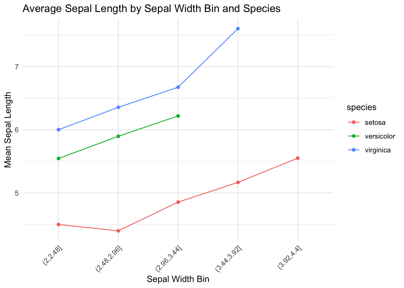
✅ Takeaway:
Line plots with grouped trends help you compare patterns side by side — especially when studying how one variable behaves across subgroups. Use color or faceting to highlight these comparisons.