Q&A 31 How do you create a donut chart to show part-to-whole proportions?
31.1 Explanation
A donut chart is a variation of the pie chart with a central hole. It helps communicate part-to-whole relationships in a slightly more readable way than standard pie charts.
- Ideal for categorical variables with a few levels
- Central space can be used for annotations or percentages
import pandas as pd
import matplotlib.pyplot as plt

df = pd.read_csv("data/iris.csv")
species_counts = df["species"].value_counts()
colors = plt.cm.Set2.colors

plt.pie(species_counts, labels=species_counts.index, colors=colors,
        autopct='%1.1f%%', startangle=90, wedgeprops={'width': 0.4})
plt.title("Iris Species Distribution")
plt.axis("equal")
plt.show()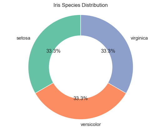
31.2 R Code
library(ggplot2)
library(dplyr)

df <- readr::read_csv("data/iris.csv")
df_counts <- df %>%
  count(species) %>%
  mutate(prop = n / sum(n), ypos = cumsum(prop) - 0.5 * prop)

ggplot(df_counts, aes(x = 2, y = prop, fill = species)) +
  geom_bar(stat = "identity", width = 1, color = "white") +
  coord_polar(theta = "y") +
  xlim(0.5, 2.5) +
  theme_void() +
  geom_text(aes(y = ypos, label = scales::percent(prop)), color = "white") +
  ggtitle("Iris Species Distribution (Donut Chart)")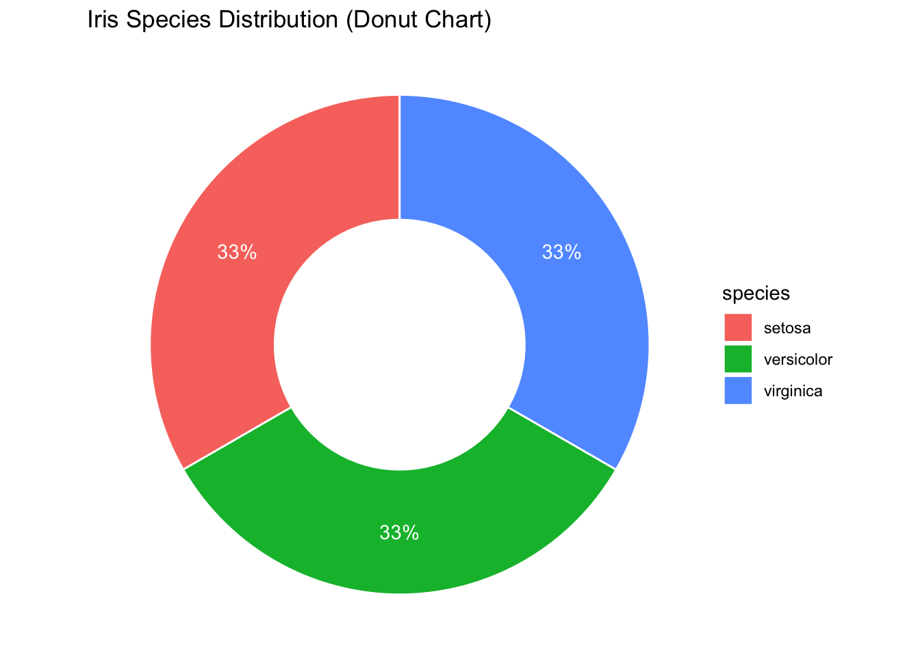
✅ Donut charts are more stylish than pie charts, but they carry the same limitations—use them only for small, clear part-to-whole comparisons.