Q&A 24 How do you enhance scatter plots by adding group color and trend lines?
24.1 Explanation
Scatter plots are a go-to tool for visualizing the relationship between two numerical variables. But they become far more insightful when enhanced with:
- Group-based coloring (e.g., by species or cut)
- Trend lines to show linear or nonlinear patterns
- Smoothers (like LOESS or regression fits)
- Transparency to handle overplotting in dense data
These enhancements help: - Detect direction and strength of relationships - Compare group-level trends side by side - Spot outliers or overlapping clusters
24.2 Python Code
import pandas as pd
import seaborn as sns
import matplotlib.pyplot as plt

# Load iris data
iris = pd.read_csv("data/iris.csv")

# Scatter with group color and regression lines
sns.lmplot(data=iris, x="sepal_length", y="petal_length", hue="species",
           palette="Set2", height=5, aspect=1.2, markers=["o", "s", "D"])
plt.title("Relationship Between Sepal Length and Petal Length by Species")
plt.tight_layout()
plt.show()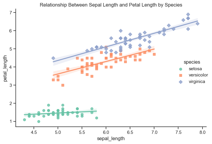
24.3 R Code
library(ggplot2)
library(readr)

# Load iris data
iris <- read_csv("data/iris.csv")

# Scatter with group color and regression lines
ggplot(iris, aes(x = sepal_length, y = petal_length, color = species)) +
  geom_point(alpha = 0.7) +
  geom_smooth(method = "lm", se = FALSE) +
  theme_minimal() +
  labs(title = "Relationship Between Sepal Length and Petal Length by Species")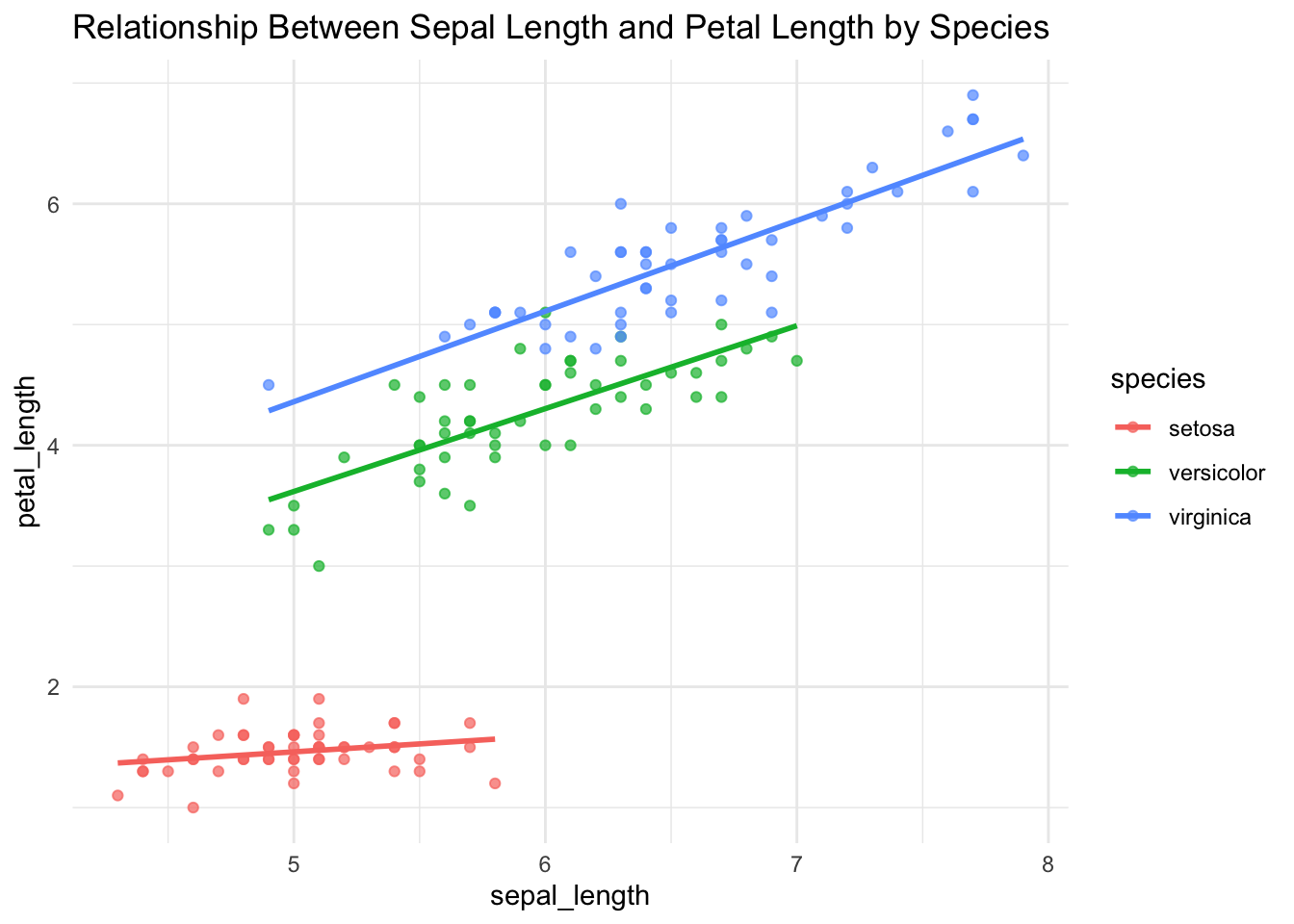
✅ Enhancing scatter plots with color and trend lines reveals both overall relationships and how those relationships vary across groups — a key part of visual EDA.