Q&A 18 How do you visualize trends across ordered groups using a line plot?
18.1 Explanation
A line plot is typically used for time series, but you can also use it to show changes over any ordered numeric variable. In this case, we’ll group diamonds by carat bins and compute the mean price.
This allows us to simulate a trend and observe how price changes with carat.
This type of plot is useful for:
- Showing trends or gradual change across bins
- Comparing multiple features over a common x-axis
- Visualizing aggregated patterns from large datasets
18.2 Python Code
import pandas as pd
import matplotlib.pyplot as plt

# Load data
df = pd.read_csv("data/diamonds_sample.csv")

# Bin carat into equal-width intervals
df["carat_bin"] = pd.cut(df["carat"], bins=10)

# Compute mean price per carat bin
mean_price = df.groupby("carat_bin")["price"].mean().reset_index()

# Convert bin labels to midpoints for plotting
mean_price["carat_mid"] = mean_price["carat_bin"].apply(lambda x: x.mid)

# Plot
plt.plot(mean_price["carat_mid"], mean_price["price"], marker="o")
plt.xlabel("Carat (binned)")
plt.ylabel("Mean Price")
plt.title("Trend of Price by Carat (Binned)")
plt.grid(True)
plt.tight_layout()
plt.show()
/var/folders/m1/0dxpqygn2ds41kxkjgwtftr00000gn/T/ipykernel_75563/1324421104.py:11: FutureWarning: The default of observed=False is deprecated and will be changed to True in a future version of pandas. Pass observed=False to retain current behavior or observed=True to adopt the future default and silence this warning.
mean_price = df.groupby("carat_bin")["price"].mean().reset_index()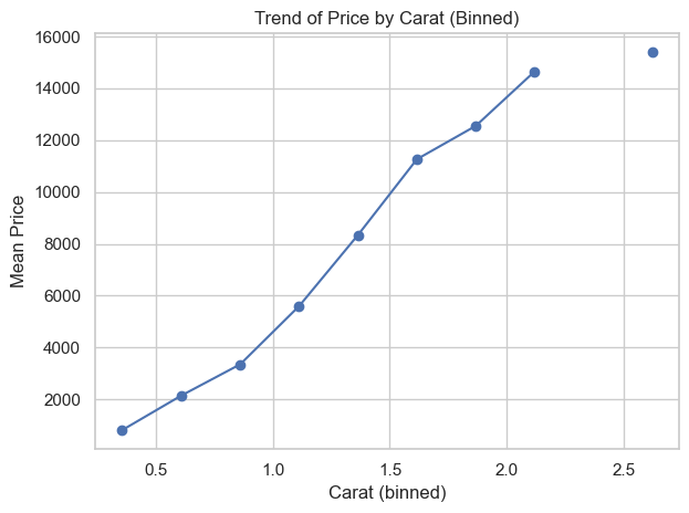
18.3 R Code
library(readr)
library(dplyr)
library(ggplot2)

# Load data
df <- read_csv("data/diamonds_sample.csv")

# Bin carat into equal-width intervals and compute mean price
df_summary <- df %>%
  mutate(carat_bin = cut(carat, breaks = 10)) %>%
  group_by(carat_bin) %>%
  summarise(mean_price = mean(price), .groups = "drop")

# Convert factor levels to midpoints for plotting
df_summary <- df_summary %>%
  mutate(carat_mid = as.numeric(sub("\\((.+),.+\\]", "\\1", carat_bin)) +
                     as.numeric(sub(".+,(.+)\\]", "\\1", carat_bin)) / 2)

# Plot
ggplot(df_summary, aes(x = carat_mid, y = mean_price)) +
  geom_line() +
  geom_point() +
  labs(
    x = "Carat (binned)",
    y = "Mean Price",
    title = "Trend of Price by Carat (Binned)"
  ) +
  theme_minimal()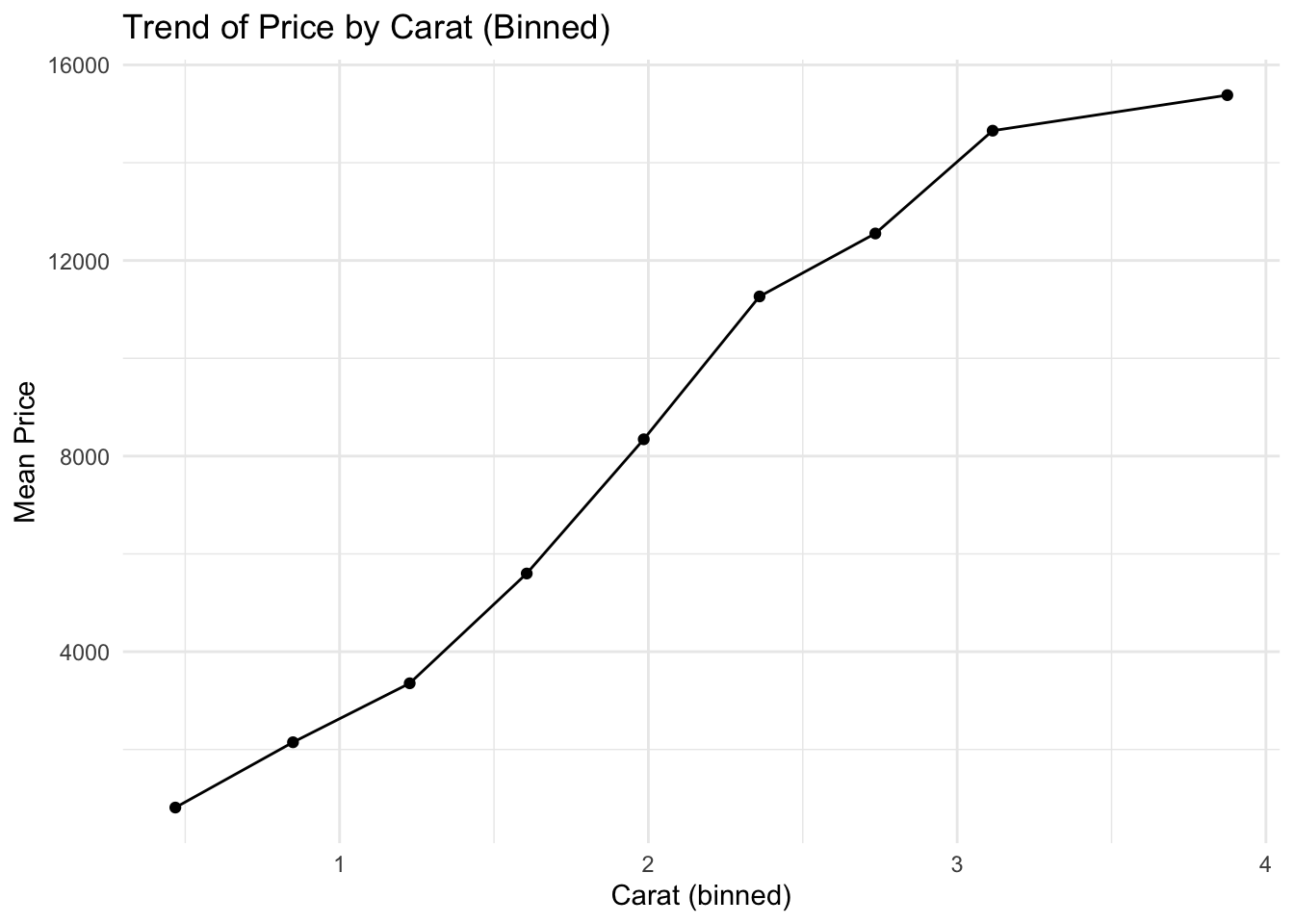
✅ Line plots are great for visualizing aggregated trends over an ordered numeric variable — not just time. Binning continuous values helps reveal smooth relationships when raw scatterplots are noisy.