Q&A 16 How do you visualize a smoothed distribution with a density plot?
16.1 Explanation
A density plot shows the probability density of a continuous variable using a smoothed curve. Compared to histograms, it offers:
- A more refined view of distribution shape
- Insight into skewness, peaks, and spread
- Easy group comparison using hue or facets
For grouped densities (e.g., price by cut), you can:
- Use fill and hue for comparison
- Overlay multiple groups for contrast
- Normalize to show relative densities
16.2 Python Code
import pandas as pd
import seaborn as sns
import matplotlib.pyplot as plt

# Load dataset
diamonds = pd.read_csv("data/diamonds_sample.csv")

# Set style
sns.set(style="white")

# Density plot with hue
plt.figure(figsize=(10, 6))
sns.kdeplot(data=diamonds, x="price", hue="cut", fill=True, alpha=0.6, palette="Set2", common_norm=False)
plt.title("Density Plot of Diamond Price by Cut", fontsize=14)
plt.xlabel("Price")
plt.ylabel("Density")
plt.tight_layout()
plt.show()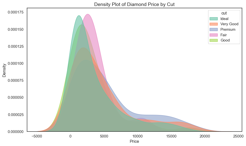
16.3 R Code
library(readr)
library(ggplot2)

# Load dataset
diamonds <- read_csv("data/diamonds_sample.csv")

# Density plot
ggplot(diamonds, aes(x = price, fill = cut)) +
  geom_density(alpha = 0.6) +
  scale_fill_brewer(palette = "Set2") +
  theme_minimal() +
  labs(title = "Density Plot of Diamond Price by Cut",
       x = "Price", y = "Density")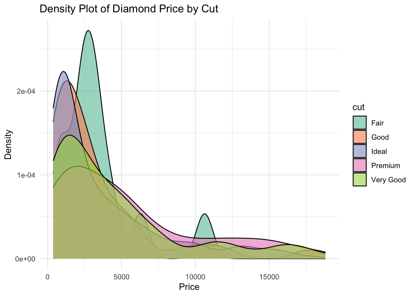
✅ Density plots provide a smooth view of distributions. They are excellent for comparing shape, spread, and modality across groups—especially when overlaid with vibrant palettes.